View All
Tillstar Home Page Upgrade
Product Design
2023

Restructured home page of Tillstar app to improve usability and visual consistency, leading to a 28.6% MAU increase.
Restructured home page of Tillstar app to improve usability and visual consistency, leading to a 28.6% MAU increase.
Restructured home page of Tillstar app to improve usability and visual consistency, leading to a 28.6% MAU increase.
Team
2 designer, 1 PM, 2 engineers
Timeline
3 months
Role
Role
Product Strategy, Product Design
About Tillstar
About Tillstar
About Tillstar
Tillstar is a global mobile payment platform for international consumers, offering secure cross-border USD accounts, dual-currency transactions, gift cards, and transfers.
Tillstar is a global mobile payment platform for international consumers, offering secure cross-border USD accounts, dual-currency transactions, gift cards, and transfers.
Tillstar is a global mobile payment platform for international consumers, offering secure cross-border USD accounts, dual-currency transactions, gift cards, and transfers.
Context
Context
MAU growth has slowed and nearly plateaued over six months
MAU growth has slowed and nearly plateaued over six months
MAU growth has slowed and nearly plateaued over six months

① MAU
① MAU
MAU growth is fixed at 200, far lower than competitive products’ 20% growth rate.
MAU growth is fixed at 200, far lower than competitive products’ 20% growth rate.
② New User 7-Day Retention Rate
② New User 7-Day Retention Rate
The New User 7-Day Retention Rate is less than 6%, far lower than competitive products’ 20% retention rate.
The New User 7-Day Retention Rate is less than 6%, far lower than competitive products’ 20% retention rate.
③ Existing User Retention Rate
③ Existing User Retention Rate
The MAU retention rate is less than 45%, lower than competitive products’ 60-70% retention rate.
The MAU retention rate is less than 45%, lower than competitive products’ 60-70% retention rate.
Design Objective
Design Objective
Key design metrics to improve MAU are New User 7-day Return Rate and Existing User Return Rate
Key design metrics to improve MAU are New User 7-day Return Rate and Existing User Return Rate
Key design metrics to improve MAU are New User 7-day Return Rate and Existing User Return Rate

① New User 7-Day Return Rate
① New User 7-Day Return Rate
Increase the new user 7-day return rate - which means enhancing the product's appeal to new users
Increase the new user 7-day return rate - which means enhancing the product's appeal to new users
② Existing User Return Rate
② Existing User Return Rate
Improve the existing user return rate - which strengthens product stickiness for current users.
Improve the existing user return rate - which strengthens product stickiness for current users.
User Data Analysis
User Data Analysis
New users has high bounce rate and scattered engagement for each section
New users has high bounce rate and scattered engagement for each section
New users has high bounce rate and scattered engagement for each section

① Weak branding and trust
① Weak branding and trust
New users can’t quickly see the product’s value on the homepage
New users can’t quickly see the product’s value on the homepage
② Poor Information Hierarchy
② Poor Information Hierarchy
Cluttered layout confuses users about core features
Cluttered layout confuses users about core features
③ Low Feature Engagement
③ Low Feature Engagement
Gift card section has near-zero engagement
Gift card section has near-zero engagement
Existing users has a low bounce rate and high engagement for core features
Existing users has a low bounce rate and high engagement for core features
Existing users has a low bounce rate and high engagement for core features
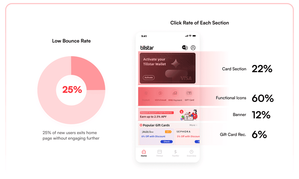
① High Existing User Retention
① High Existing User Retention
Most existing users have clear purposes, resulting in low bounce rates.
Most existing users have clear purposes, resulting in low bounce rates.
② Poor Information Hierarchy
② Poor Information Hierarchy
Primarily use deposit/withdrawal/RMB payments.
Primarily use deposit/withdrawal/RMB payments.
③ Low Feature Engagement
③ Low Feature Engagement
Cluttered layout, unclear hierarchy, key features are hard to find.
Cluttered layout, unclear hierarchy, key features are hard to find.
④ Ineffective Banner Section
④ Ineffective Banner Section
Banners and gift card sections show weak appeal to existing users.
Banners and gift card sections show weak appeal to existing users.
Competitive Analysis
Competitive Analysis
Analyze Cash, Wise and PayPal's homepage layouts, new user retention strategies, and existing user re-engagement approaches.
Analyze Cash, Wise and PayPal's homepage layouts, new user retention strategies, and existing user re-engagement approaches.
Analyze Cash, Wise and PayPal's homepage layouts, new user retention strategies, and existing user re-engagement approaches.

① Clear Information Hierarchy
① Clear Information Hierarchy
Simple UI that highlights key features and prevents user friction.
Simple UI that highlights key features and prevents user friction.
② To new users
② To new users
Showcase product values and drive new user activation through promotional incentives
Showcase product values and drive new user activation through promotional incentives
③ To existing users
③ To existing users
Highlight high-frequency functions on homepage.
Highlight high-frequency functions on homepage.
Design Problems → Design Solution
Design Problems → Design Solution
Cluttered features hide core value, and inconsistent design turns users away
Cluttered features hide core value, and inconsistent design turns users away
Cluttered features hide core value, and inconsistent design turns users away


Redesign & Revitalize: Optimized layout and visual identity to drive engagement, trust, and retention
Redesign & Revitalize: Optimized layout and visual identity to drive engagement, trust, and retention
Redesign & Revitalize: Optimized layout and visual identity to drive engagement, trust, and retention


Reconstruct Layout
Reconstruct Layout
Prioritized features by usage frequency, merged highly correlated functions, and deprioritize low-engagement modules
Prioritized features by usage frequency, merged highly correlated functions, and deprioritize low-engagement modules
Prioritized features by usage frequency, merged highly correlated functions, and deprioritize low-engagement modules

The new home page layout is broken down into sections of Card Management, Account Management, Purchase&Payment, and Marketing Materials
The new home page layout is broken down into sections of Card Management, Account Management, Purchase&Payment, and Marketing Materials
Design Showcase —
Design Showcase —
Card Management
Optimize card layout with foldable UI and hide account info for better privacy
Optimize card layout with foldable UI and hide account info for better privacy
Optimize card layout with foldable UI and hide account info for better privacy

① Problems
① Problems
Section has large real estate but features are clustered and hidden from new users. Exposed routing number also rises security concerns.
Section has large real estate but features are clustered and hidden from new users. Exposed routing number also rises security concerns.
② Design Solutions
② Design Solutions
Adopt foldable card design to reduce screen space. Hide routing/account numbers to enhance privacy.
Adopt foldable card design to reduce screen space. Hide routing/account numbers to enhance privacy.
Design Showcase —
Design Showcase —
Bank Account Management
Reorganize functional hierarchy and enhance visual focus for core features
Reorganize functional hierarchy and enhance visual focus for core features
Reorganize functional hierarchy and enhance visual focus for core features

① Problems
① Problems
Unclear functional hierarchies with unrelated functions grouping together. The core feature area has weak visual focus due to light icon backgrounds.
Unclear functional hierarchies with unrelated functions grouping together. The core feature area has weak visual focus due to light icon backgrounds.
② Design Solutions
② Design Solutions
Dedicate the whole section for account management. Use brand colors for primary action buttons to drive visual focus.
Dedicate the whole section for account management. Use brand colors for primary action buttons to drive visual focus.
Design Showcase —
Design Showcase —
Purchase & Payment
Reorganize functional hierarchy and enhance visual focus for core features
Reorganize functional hierarchy and enhance visual focus for core features
Reorganize functional hierarchy and enhance visual focus for core features

① Problems
① Problems
Large visual real estate for section with weak appeal and low conversion.
Large visual real estate for section with weak appeal and low conversion.
② Design Solutions
② Design Solutions
Collapse and merge low-converting sections and replace it with more prominent features. Unify color, icon style and typography to ensure visual consistency.
Collapse and merge low-converting sections and replace it with more prominent features. Unify color, icon style and typography to ensure visual consistency.
Impact
Impact
2023.05.02 - 2023.05.8
2023.05.02 - 2023.05.8
2023.05.02 - 2023.05.8


2023.05.02 - 2023.05.8
2023.05.02 - 2023.05.8
2023.05.02 - 2023.05.8

